Color Psychology
The legal cannabis industry has been inundated with newcomers trying to capitalize upon its recent booming success. Such a saturated market is confusing for the consumer. In a sea of relatively similar choices, how can you set yourself apart from the competition?
Branding of course!
When our target consumers become overwhelmed by a dispensary shelf’s vast selection or a long list of choices on a website, visually standing out is the key. What kind of packaging can help us not only stand out, but also subliminally share our value propositions with our customers, without them even having to read a word?
The answer lies within the psychology of color. Breaking away from the market’s standard black, white, brown and green and utilizing the subliminal effects that other, not-so-commonly used colors have on the minds and moods of your target markets.
Colors That Promote Positive Reactions
Cool Tones
Blue is popular within the industry because it is tranquilizing and emphasizes upon the soothing and calming properties of the product; however, there are still possibilities to use variations of the color blue as a differentiating feature. Pastels are not commonly used – is it possible for a light or baby blue to also portray calming effects while positioning yourself apart from the competition? Turquoise specifically encourages a sense of healing, which applies to a wide range of industry products as well.
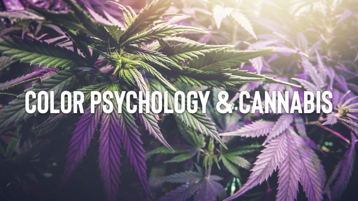
Purple is historically associated with royalty and spirituality and shares the subliminal tranquil messaging with the color blue. Purple’s contrasting color is green, the most popular and abundant color in this industry, therefore, when applied correctly, purple could pull your consumers’ attention away from the competition and towards your brand.
While cooler tones foster your brand’s ability to soothe and heal a client, warmer tones help further your brand’s social functions and feelings of positivity.
Warm Tones
Variations of the color red are stimulating, eye-catching and exude a burst of energy. If your brand messaging aims to energize and excite consumers, red packaging helps communicate that brand value. Similarly, pink is joyful and rejuvenating and is associated with health. If your target consumer is a first-time user of cannabis products, creating a brand identity around a refreshingly new experience, the color pink can help signify a new era. Perhaps, your message focuses on overall well-being – pink also represents a healthy lifestyle.
Yellow and orange are bright, attention-getting colors that convey happiness, enthusiasm and social friendliness. Like the sun, they are subconsciously associated with warmth and uplifting energy. I think it’s safe to say, the majority of targeted consumers are aimed at promoting such feelings, so you can’t go wrong with these colors. If a product is designed for social situations with the primary function of bonding, these colors can also help strengthen that brand identity.
Why Consider Colors in Cannabis Marketing?
This new market has so many new emerging brands with every new state that allows for legal cannabis sales. Due to strict cannabis marketing regulations, you have to creatively communicate with your consumers visually. Utilizing color psychology helps subliminally message your brand values without the traditional methods of advertising.

